Code
A scatter plot (or scatter diagram) is a type of plot or mathematical diagram using Cartesian coordinates to display values for typically two variables for a set of data. The data is displayed as a collection of points, each having the value of one variable determining the position on the horizontal axis and the value of the other variable determining the position on the vertical axis.
Example of a Scatter Plot: Imagine you have a dataset with the ages of a group of people and their corresponding systolic blood pressure readings.
Importance:
Relationships: Scatter plots are particularly useful for determining the relationship or correlation between two variables. This can be especially helpful in spotting trends, clusters, and outliers.
Correlation detection: They make it easy to see if an increase in one variable correlates with an increase in another (positive correlation), a decrease in another (negative correlation), or no correlation.
A scatter plot can be used to visualize any correlation between age and blood pressure.
The scatter plot might show that as age increases, blood pressure also tends to increase, indicating a positive correlation.
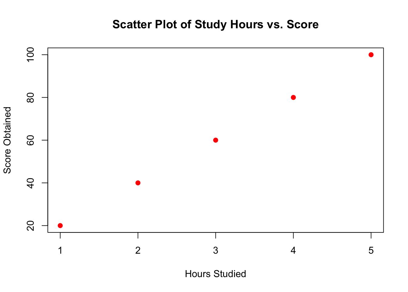
Let’s take an example dataset that includes hours studied and scores obtained by students to demonstrate how to create a scatter plot using both R and Python.
| Hours Studied | Score Obtained |
|---|---|
| 1 | 20 |
| 2 | 40 |
| 3 | 60 |
| 4 | 80 |
| 5 | 100 |
We’ll visualize this data to see if there’s a correlation between the number of hours studied and the scores obtained.
In R, you can use the plot() function from the base package to create a scatter plot.
In Python, you can use matplotlib.pyplot to plot a scatter plot. This library is part of the larger Matplotlib library, which is a comprehensive library for creating static, animated, and interactive visualizations in Python.
import matplotlib.pyplot as plt

# Data
hours_studied = [1, 2, 3, 4, 5]
score_obtained = [20, 40, 60, 80, 100]

# Create a scatter plot
plt.scatter(hours_studied, score_obtained, color='blue')
plt.title('Scatter Plot of Study Hours vs. Score')
plt.xlabel('Hours Studied')
plt.ylabel('Score Obtained')
plt.show()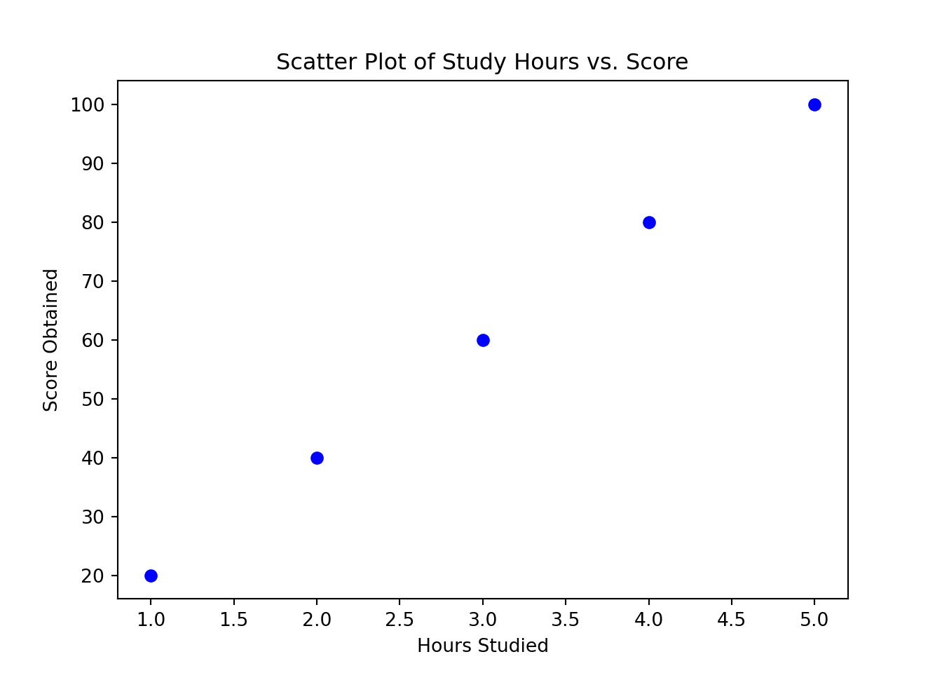
In both examples, you define two lists or vectors: one for the hours studied and one for the scores obtained. Then you use plotting functions to create a scatter plot where each point’s position on the plot corresponds to a pair of values from these lists. The title, xlabel, and ylabel provide labels for clarity. The scatter plot will show a clear positive linear relationship, suggesting that higher study hours might be associated with higher scores.
A histogram is an accurate representation of the distribution of numerical data. It is an estimate of the probability distribution of a continuous variable (quantitative variable) and was first introduced by Karl Pearson. A histogram consists of contiguous (adjacent) boxes. It groups numbers into ranges (bins). The height of each box depicts the number of data points that fall within each range.
Importance:
Distribution: Histograms provide a visual interpretation of numerical data by indicating the frequency of data points within certain ranges of values. This helps in understanding the distribution (e.g., normal distribution, skewed, bimodal) of the data.
Outliers and shape: They help identify outliers and the overall shape of the data distribution, which are critical in statistical analyses and assumptions required for applying various statistical tests and models.
Example of a Histogram: Consider you have data on the test scores of students in a particular exam. The histogram can show how many students achieved scores within certain score ranges (e.g., 0–10, 11–20, etc.).
From the histogram, you might observe most students scoring between 50 and 70, which could indicate the test’s difficulty level or the average student’s preparedness.
These visual tools help researchers, analysts, and businesses to analyze large amounts of data quickly and effectively, making informed decisions based on visual insights.
Sure, let’s continue with the theme of students’ scores, but this time, let’s imagine a larger dataset representing the distribution of scores on a test. Here’s the example dataset we’ll use for creating histograms:
| Scores |
|---|
| 55 |
| 70 |
| 65 |
| 85 |
| 90 |
| 75 |
| 60 |
| 95 |
| 80 |
| 70 |
| 65 |
| 50 |
In R, you can use the hist() function from the base package to create a histogram.
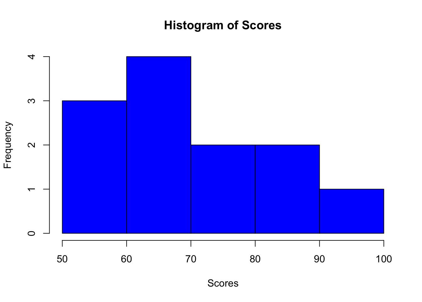
This code snippet creates a histogram with 5 bins (groups of scores). The color of the bars is set to blue, and labels are added for clarity.
In Python, the matplotlib.pyplot library can be used to create histograms as well. Here’s how you can do it:
import matplotlib.pyplot as plt

# List of scores
scores = [55, 70, 65, 85, 90, 75, 60, 95, 80, 70, 65, 50]

# Create a histogram
plt.hist(scores, bins=5, color='blue', edgecolor='black')
plt.title('Histogram of Scores')
plt.xlabel('Scores')
plt.ylabel('Frequency')
plt.show()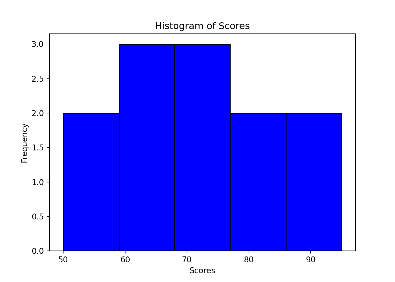
This Python code does something very similar to the R code. It defines a list of scores, and then plt.hist() is used to create a histogram with 5 bins. The histogram bars are colored blue with black edges for better visual distinction. Labels and a title are added to enhance understanding of the plot.